Sporting KC
LOOK: More Hi-Res Pics of Sporting KC’s New Kit
21 high resolution photos of the 2024-25 Sporting Kansas City secondary kit — Diamonds Our Forever aka Argyle 3.0.
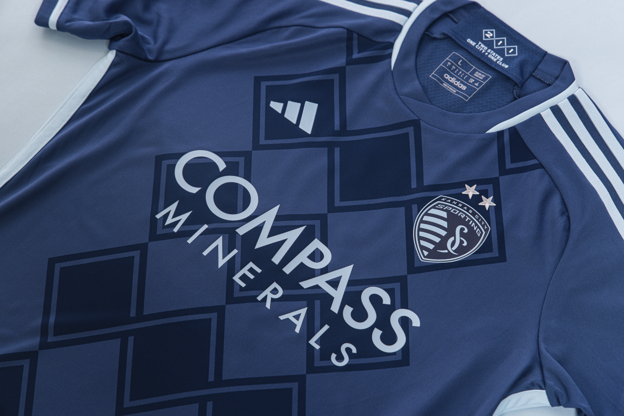
Last week, lost in the chaos of what should have otherwise been a joyous week, Sporting Kansas City unveiled their new secondary jersey. While it’s being referred to as “Diamonds Our Forever,” I prefer to call it Argyle 3.0. A call back to the black, and later white, argyle kits from the mid-2010’s.
While those kits were alternative, third kits, this sticks more closely to the Sporting KC color scheme with indigo prominently displayed as one of SKC’s secondary colors. Instead of a traditional argyle design, the pattern does have a diamond vibe to it with the interconnected lines we’ve seen the letters S-K-C prominently displayed in on all things Sporting Kansas City for the last few seasons.
Kansas City will wear these new secondary kits for the 2024 and 2025 seasons. Next year, Hoops 4.0 will be up for replacement. I’m in the minority that will be completely fine with Hoops 5.0 replacing it.
As for the third kits we’ve heard so much about, last year third kits didn’t show up until the end of the summer when Atlanta United, New York City FC, Red Bulls New York and Toronto FC got third kits. I’d expect the same for the rumored Kansas City third kit that may pay homage to their days as the KC Wizards.
The Photos
A jersey always looks better on a player. Sporting KC were nice enough to send out photos to the media of Johnny Russell, Alan Pulido and Daniel Salloi showing off the new design.


In addition, they have some really close up shots to see all the details.


There are lots of little details that are easy to miss at first glance. I personally am a fan. I really like Hoops 3.0 and 4.0, but some of the secondary kits have been misses for me. It’s not my favorite Sporting KC kit ever, but it’s a good look and a much more bold design and in recent years. I look forward to seeing them in action.


Sporting KC falls on road to LAFC counters

Current Fall on the Road in Rhode Island

PRO Referees Admit Mistake in Sporting KC vs. St. Louis City

Preview: Sporting KC on the Road Against LAFC

Match preview: Kansas City Current @ Boston Legacy

Match Preview: Sporting Kansas City vs. Minnesota United FC

MLS Power Rankings: We’re Back!

Sporting KC Return and the World Cup Ends

Juice Boxes and Post Game Stats: SKCII Record First Shutout


Another SKC kit that looks fine but boring. This is less argyle than it is a checkerboard.
Hard disagree. This is way more argyle than the previous argyle that was more three diamonds. Slap some sweater sleeves and a contrasting color to this and it looks like an argyle sweater.
I’m not exactly thrilled with it either, but I bet it grows on me and I’ll probably cave and buy one since I have the other two argyle designs in the closet.
Test
We can see this. Your test was successful! 🙂
It would be great if you could do an in depth article in response to this article and educate us on how SKC fits into the scouting/recruiting/analytics piece of the MLS evolution. See here:
https://sports.yahoo.com/mls-is-ready-to-take-off-its-financial-training-wheels-161320365.html
I read that story the other day but I’m not sure what I can add to it. I have it on a list of links for one of our “journal entry” stories. But yeah, I hate the way they restrict spending.
Essentially, they don’t trust the teams. Let them screw up in their own ways. Every team is owned by billionaires, they’ll be fine.
I would be happy if this were the primary home kit. Hoops are boring.