Sporting KC
LOOK: 10 High Resolution Pics of Sporting KC’s New Jersey
Take a look at the new 2025 Sporting Kansas City primary kit. It’ll be joined by the “Diamonds are Forever” kit from 2024.
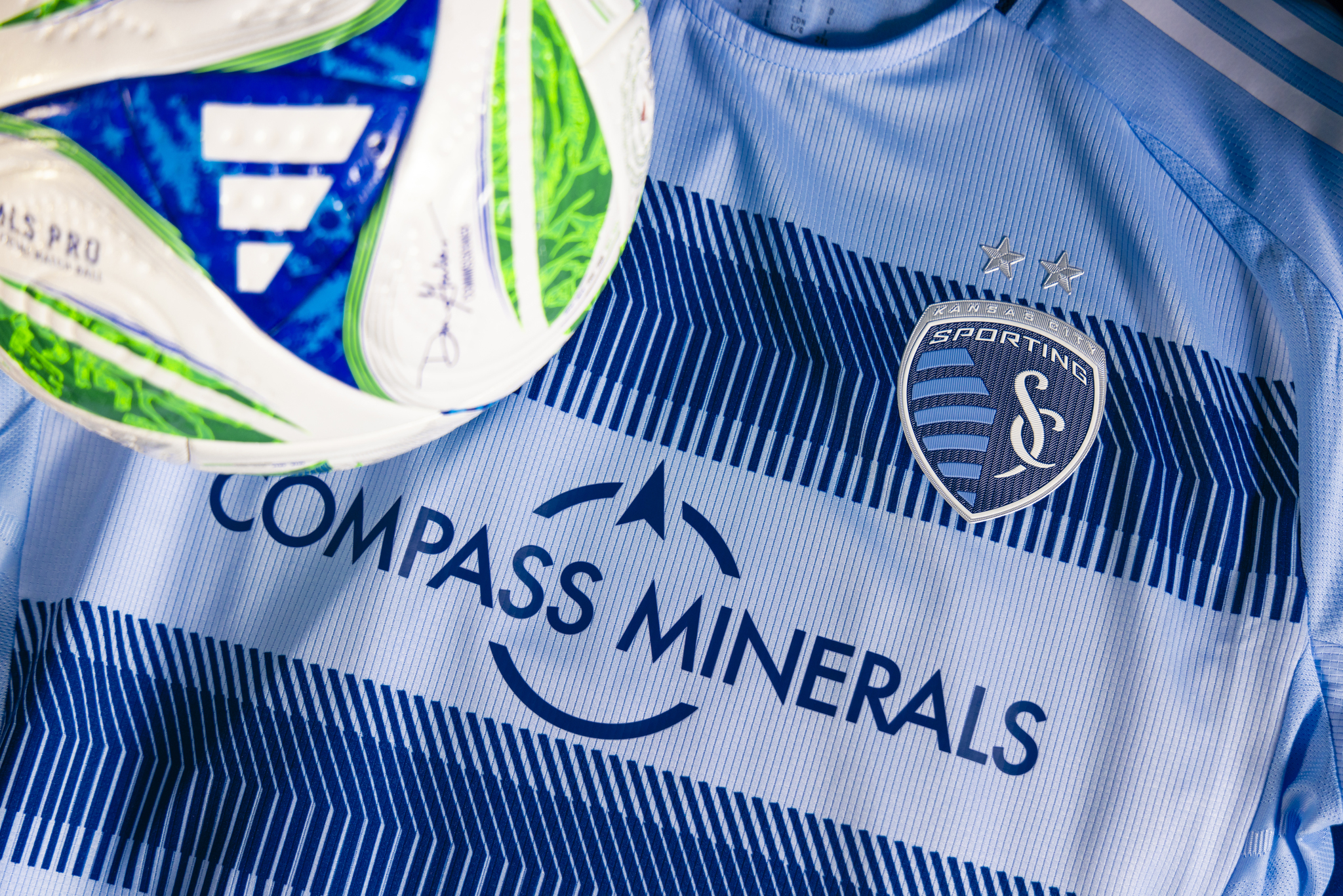
On Friday, Sporting Kansas City unveiled their new 2025 primary kit. Dubbed the “One KC” kit, it features the hoops design that has become the team’s brand since the 2021 launch of Hoops 2.0. The jersey is in the familiar “Sporting Blue” and accented with indigo “hoops.”
What is a little more subtle is the “state line” pattern across the hoops. A keen eye will show the familiar border between Kansas and Missouri that divides Kansas City, KS and Kansas City, MO.
If it looks familiar, the kit leaked on Christmas Eve of 2024.


Other Impressions
The team announced the launch with a blitz of media. The video from this morning has a blue hue on it but shows the jersey in motion.
Our iconic Hoops meet the State Line.Introducing: One KC Kit
— Sporting Kansas City (@sportingkc.com) 2025-02-14T16:00:05.218Z
Sporting KC also put out other photos on their social media, that weren’t included in the ones sent to the media.
The aura in this photo is unreal
— Sporting Kansas City (@sportingkc.com) 2025-02-14T22:59:55.505Z
For our community on both sides of the State Line. For One KC.Shop the One KC Kit 🛍️: skcsoccer.co/42Vvdvu
— Sporting Kansas City (@sportingkc.com) 2025-02-14T16:05:05.964Z
Impressions
CBS Sports has rated it the best kit of the year in Major League Soccer.
CBS Sports gets it 😎 📰: www.cbssports.com/soccer/news/…
— Sporting Kansas City (@sportingkc.com) 2025-02-14T21:29:06.403Z
ESPN did not. The truth is probably somewhere in between.
ESPN ranked the kit 24 out of 30 teams, but also gave a mostly white t-shirt from D.C. United their 3rd spot. The words below the jersey were even more harsh, ending with “but at least they are sticking with stripes as they try to establish a visual identity for a club whose brand and culture is mostly forgettable at this point.”
Feels a little personal for the author.
I will say, the jersey looks much better in person, as is often the case. The players wore it during media day, and they pulled it off.
Meet your new #SportingKC Designated Players. Manu Garcia (left) and Dejan Joveljic.
— Chad Smith (@chadcsmith.bsky.social) 2025-02-15T00:29:56.024Z
The white on the sides and shoulder don’t stand out nearly as much as they did in the leaked photos. And from a distance, it’s the familiar hoops branding that I personally have an affinity for.
What do you think of the new kit? Let us know in the comments?


Sporting KC Sign 15-Year-Old CB Luca Antongirolami

Round of 16 for USMNT: The danger & doom of Belgium

Juice Boxes and Post Game Stats: Cooper Scores Current’s 200th Goal

Current Exorcise Road Woes in Win Over Denver

Ghana Can’t Overcome Colombia or Their Fans in Kansas City

KC Current Announce Roster Moves with Free Agency Opening Today

Sporting KC Add 25-Year-Old Colombian CB Moises Mosquera

Shades of Blue on World Cup moments, new SKC signing

Across State Lines: Sentnor Signs New Deal with Angel City


I would say ESPN is far closer to the truth. But I’m not a fan of the false hoops anyway (hoops go all the way around). The state line detail is nice, but you can’t really see it from afar and just using the state line jersey would be far better. And the argyle would be a more unique branding as well. Finally, why are the stripes white?
I agree, the adidas stripes and the side panels should just be indigo.
To your other points:
I’m personally a fan of hoops/stripes, but this is probably the worst of them. It’s too busy. At a distance it’ll just look like hoops/stripes though.
You’ve mentioned the rule against half dark half light before, but I don’t really get it. Aren’t stripes half dark half light? Sounds like a bullshit MLS rule.
There’s a certain percentage of the jersey that can be light or dark and be acceptable. Hoops 1.0 had a 50/50 ratio of light and dark and is therefore not acceptable anymore under MLS rules. 2013 State Line had too much indigo to count as a “light” kit.
That’s why the more recent iteration of the hoops kits have been heavily sporting blue with smaller dark bands.
What David said.
It is freaking ugly. This is a complete disaster. The white is horrible. The stars are invisible. The female fit style lines are awful. I will not buy this.
I’m in the ESPN camp. Not only is their quote sadly accurate for the last few years, but the kit is a combination of fugly and tone deaf.
1) Fake hoops that don’t go all the way around. I don’t like hoops anyway but at least make them real.
2) The most visible part of the front is the Adidas logo; both the crest and sponsor fade into the background. That would be fine if the Adidas logo did the same, but not when it stands out as bright white. Screws up the visual identity of the kit.
3) I detest the “slimming strips” or whatever they’re called along the side, that make the jersey look like a tourist-trap gimmick shirt. (in fairness, not limited to SKC this year)
4) The state-line design is great in concept but are they really so tone-deaf as to not realize that many fans associate the “tire tread” pattern with SKC’s collapse as a proud franchise?
The core problem, which AFAIK is outside SKC’s control, is the ridiculous deal that forces the whole league to use a single kit-maker with a limited template that constrains individual design choices. But even within that constraint, there are some really good kits this year. For example, Seattle’s is a better SKC kit than I’ve seen for the latter in years.
After seeing last year’s Wizards throwback, I’m ready for the team to rebrand back to Wizards and use that kit.
Fair points (I won’t repeat from my comments above)
All the talk of the 3rd kit reminds me I didn’t ask anyone if they are actually wearing it this year. In 2023 a few teams had 3rd kits and I don’t recall seeing them in 2024 (then again, the season went so bad I wasn’t watching many other MLS teams). I’ll need to follow-up on that.
You have to zoom in for the details, but Salloi’s mustache is actually made of little state lines.
Say “blue boom box” 5 times fast.
This kit is perfectly fine. It’s the club’s primary identity. We use hoops/stripes for the primary kit. You want a crazy kit? That’s what the secondary kit is for. Compared to most of the league this year, our primaries are perfectly fine. The best kits produced are all secondary kits. The Adidas template this year sucks but it is what it is. Same as the Swiss Dots kit that was ruined by the shoulder stripes that Adidas forced on everyone.
The two best kits we’ve ever had aren’t allowed by the competitive rules anymore – 2013 State Line and Hoops 1.0.
The ESPN article was trash. Seattle has the best kits by far but DCU being 3rd? What a joke. Most teams are putting out dogshit this year.
I think the point about secondary kits is a good one. I think the argyle/diamonds kit from last year is really good. I know not everyone loved it. I think the 3rd kit was great.
If you don’t like stripes/hoops, you are going to be disappointed every other year at a minimum because I think it’s here to stay. Looking around the league at the 2025 kits, there are a bunch where it doesn’t need a crest, and you’d know who it is (and they look good): Atlanta, Austin, Vancouver, Montreal.
There are others who are clearly identifiable based on colors who are fine: Cincinnati, Miami, Orlando, Houston.
The only kits that are primaries that aren’t just the team’s “brand” are probably Portland (which arguably is identifiable by color, but the tree rings are a great touch and San Jose (which I low key love).
There are other teams with their primary and they are boring as hell (St. Louis and Nashville). But there are a bunch of really bad secondaries, which is where the ambition should lie (Chicago, Colorado, LAFC, RBNY, FC Dallas, San Diego [which expansion jerseys usually are terrible]).
For one, I am not a fan of the hoops. They just don’t give enough flexibility to be creative with the primary. Fair point that the secondary’s are the more creative ones, but you can still do cool things with the primary if you leave yourself room to work with.
Secondly, they’re not going to let us do the state line design again, so why do we keep trying to force it into other designs? Feels like a visual reminder of how we have a hard time letting go of the past…
Third, the shaping lines have ruined so many of the kits across the league. RSL could have had one of the coolest ones but the lines completely throw off the pattern. It’s not good for ours either.
And last, hard disagree on Seattle’s being the best; Columbus’s design is much much better.
I agree that the Adidas template sucks. I wish they’d let teams find their own kit provider.
This idea that our primary has to be “creative” is a uniquely American perspective and only for soccer. Nobody is complaining that the Chiefs’ jersey hasn’t changed in 60 years. Nobody complains about the Green Bay Packers or that the Yankees always wear pinstripes.
In global soccer, teams like Barca always have some version of blue and red stripes. PSG has the same general design. Madrid is always white. In the premier league, teams rarely change their primary kits in any meaningful way. Liverpool is always solid red – sometimes with a subtle pattern sometimes not. Chelsea is always blue. Even Villa and WetSpam always do claret and cobalt with pretty minimal changes to the overall template.
This idea that we have to have wild variances to the primary is really peculiar. I’d encourage people to go back and look at what fans have said about each kit we’ve released since State line 1.0. People hated the graphing paper. They hated the white collar with pinstripes. Hated the tire treads. Hated the black kits (ThEy’Re NoT bLuE!!!!!”). Every year people complain about the kit but the reality is that we’re at least putting out a design unlike places like DC or Dallas (plain white).
I wish we’d take bigger swings with the secondary kits. But primary kits aren’t meant to be wildly different every year.
I actually fully agree that kits shouldn’t change so much and the irony is that, as you say, plenty of North American sports jerseys ARE pretty stable. The whole fashion-show new-kit-every-year-with-designer-babble thing is one of my least favorite bits about North American soccer. I could live with most of the basic SKC designs we’ve had, even tire stripes, if they just settled on one, but screwing with it constantly just resets the expectation that it could be better.
I get what you’re saying and I’d say that my comment about the primary agrees with that. I’m saying that there are subtle things you can do within a primary kit that feel difficult to do with the hoops. And I also just don’t super like the hoops.
Real Madrid is a great example. Their white primaries this year have a pattern to them and gold accents. There’s not a ton of variation, but I still think it looks awesome. We can’t do something like that with hoops though since we already have a pattern.
I think the club would say that the “state line” pattern in the hoops is their attempt to do a fun accent piece.
Hoops isn’t really my favorite but I understand why we want a brand and an identity. I also think people have complained about the kit every single year no matter what.
If we win a trophy in it, it’ll be iconic. If we get the wooden spoon, it’ll be reviled.
True, they can wear Fruit of the Loom undershirts if they bring home some silverware. I think I’m just not a fan of hoops, so I guess I’ll have to be disappointed every other year. But, as I told a friend of mine, at least there was some effort put into it unlike Dallas or LAFC this year.
On the Columbus kit… it’s fine, I guess. At least it’s their colors unlike some teams. But now they’ll have Goosebump branding for 2 seasons (unless you are Miami and can change both kits in a year to sell more Messi jerseys).